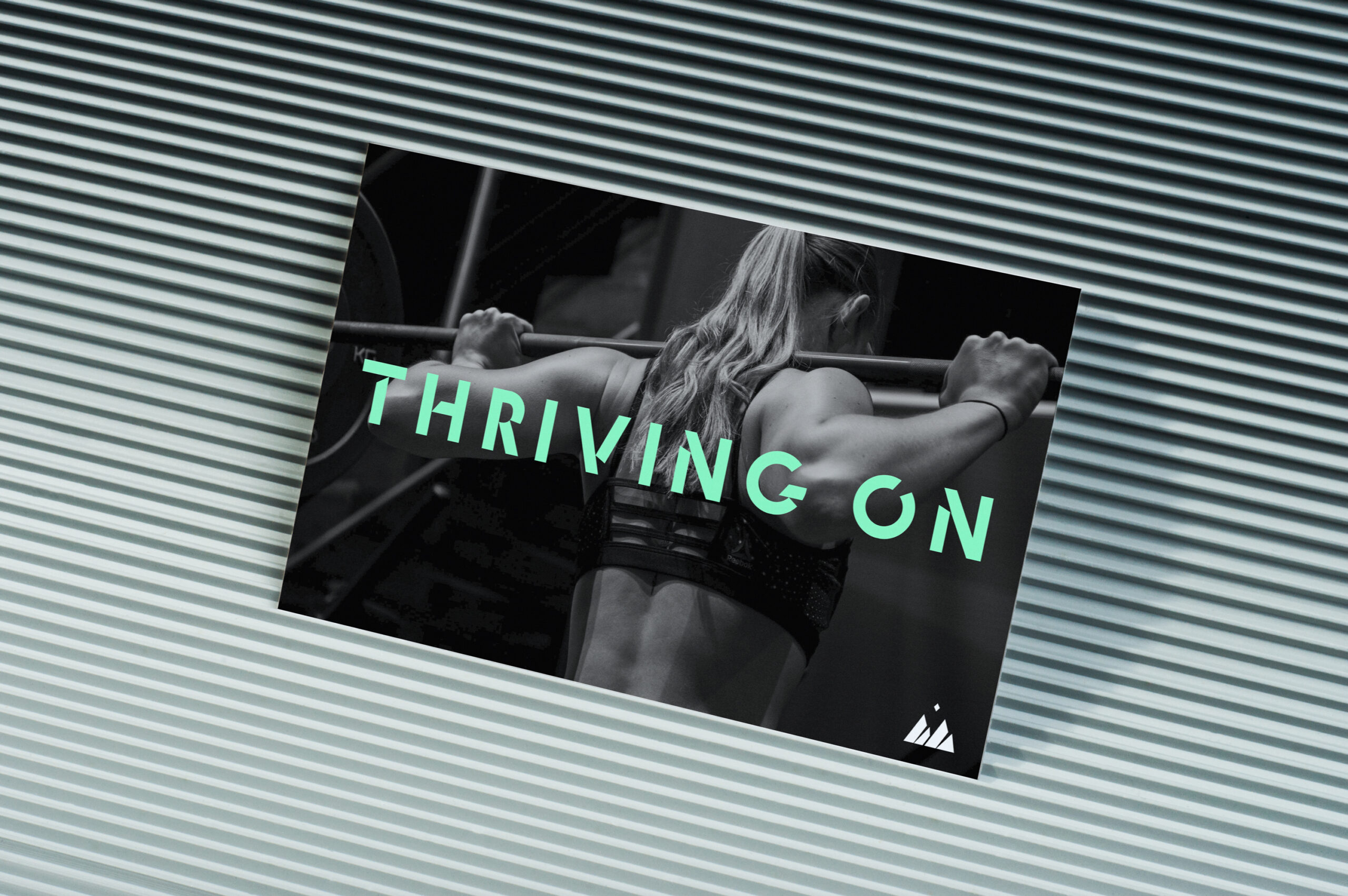
Hardcore nutrition with softcore appeal
Hardcore nutrition with softcore appeal
Hardcore nutrition with softcore appeal
Hardcore nutrition with softcore appeal
STRATEGY
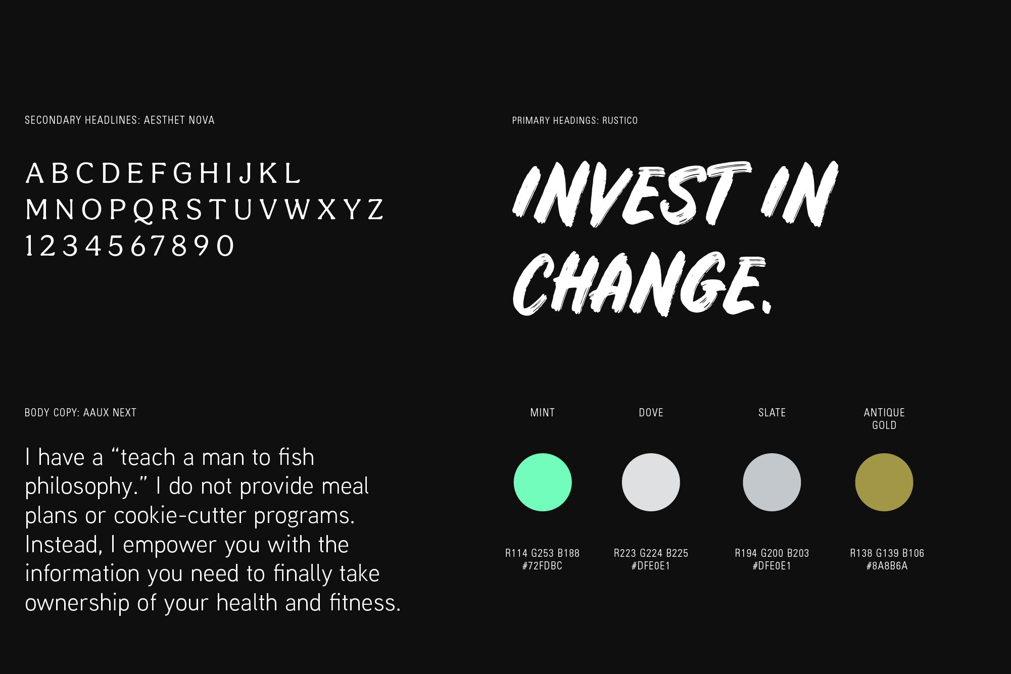
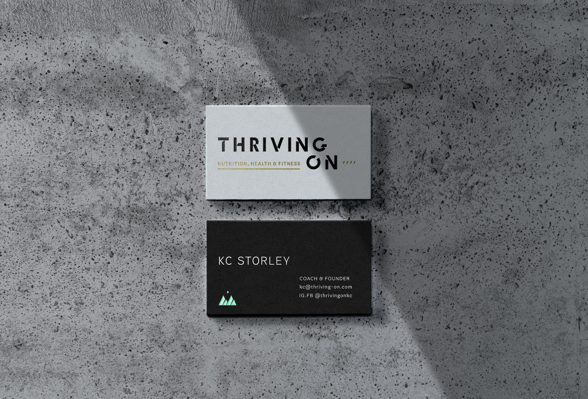
BRAND IDENTITY
COPYWRITING
WEBSITE DESIGN

A nutrition coaching service that offers universal and empowering diet change.
Thriving On is a nutrition services company that serves to empower clients with the educational and knowledge to lead healthier, fitter and more self-loved lives. Through brand identity, tough love tone of voice and fitness-led brand positioning, we present a brand serves all those who want to invest in lifelong health and fitness.

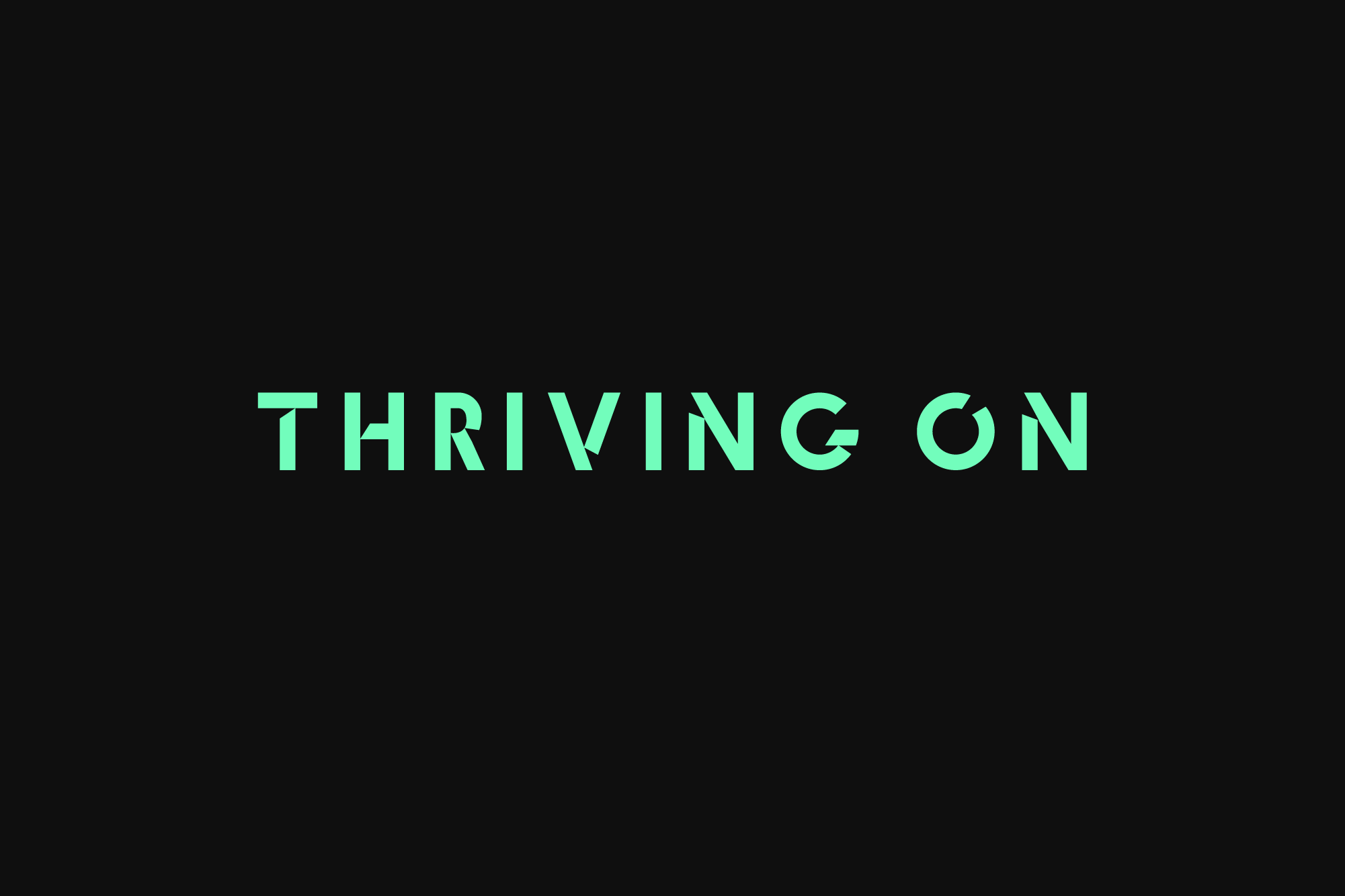
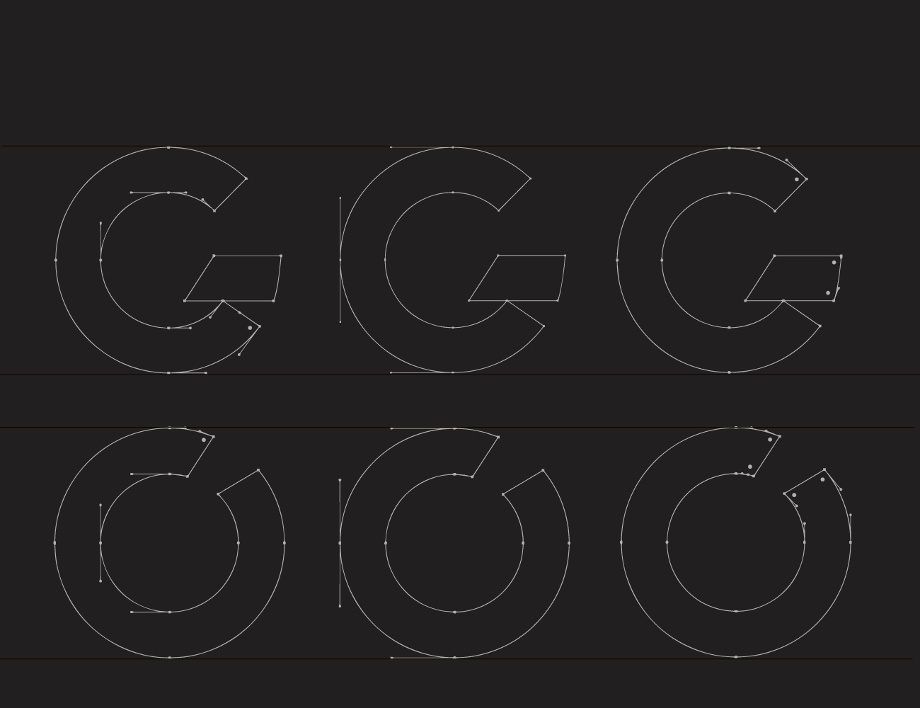
Progress as the visual foundation
The foundation of the wordmark is a nod to the classic circular progress bar. At Thriving On, Coach KC always views her clients as a 'work in a progress'. The visual language of abstract and diagonal marks continues to the mountain logo. This powerful symbol of embracing experiences and challenges speaks to the immensity of a health and fitness journey.

Nutrition education served socially
We refined KC's social media strategy and identity at its core. By abolishing the typical weightloss-centric narrative, we promised a nutrition services company focused on real nutrition, life wellness and athletic performance. We also shared a deeper side of KC's personal fitness journey. This compassionate approach delivered an enormous increase in impressions, new client inquiries and an immediate uptick of follower engagement.
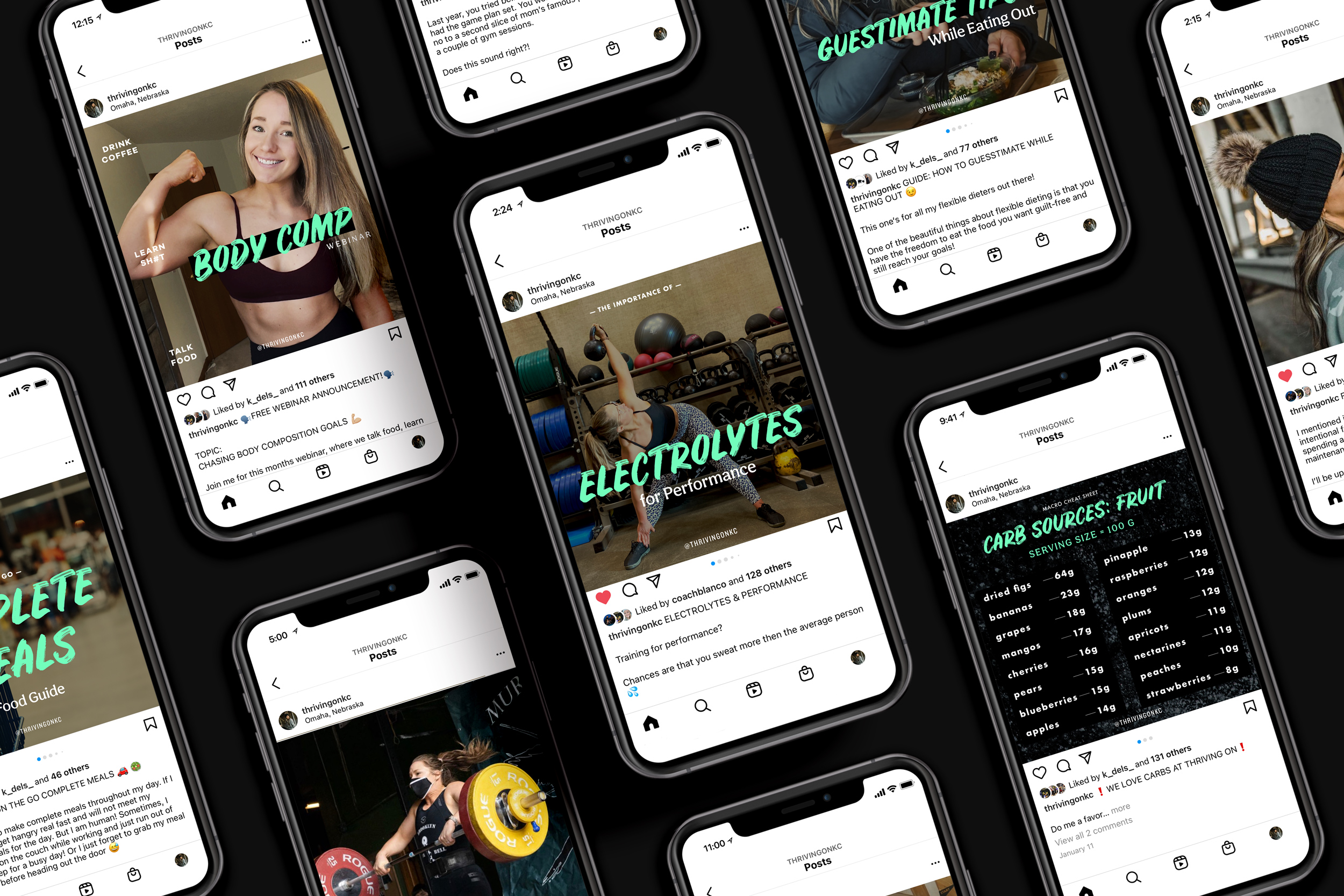
SOCIAL STRATEGY
—AVG. WEEKLY INSIGHTS
(3 month period)
4.5k → 24k INCREASE IN IMPRESSIONS
95 → 405 AVG CONTENT INTERACTIONS
600 → 2400 ACCOUNTS REACHED
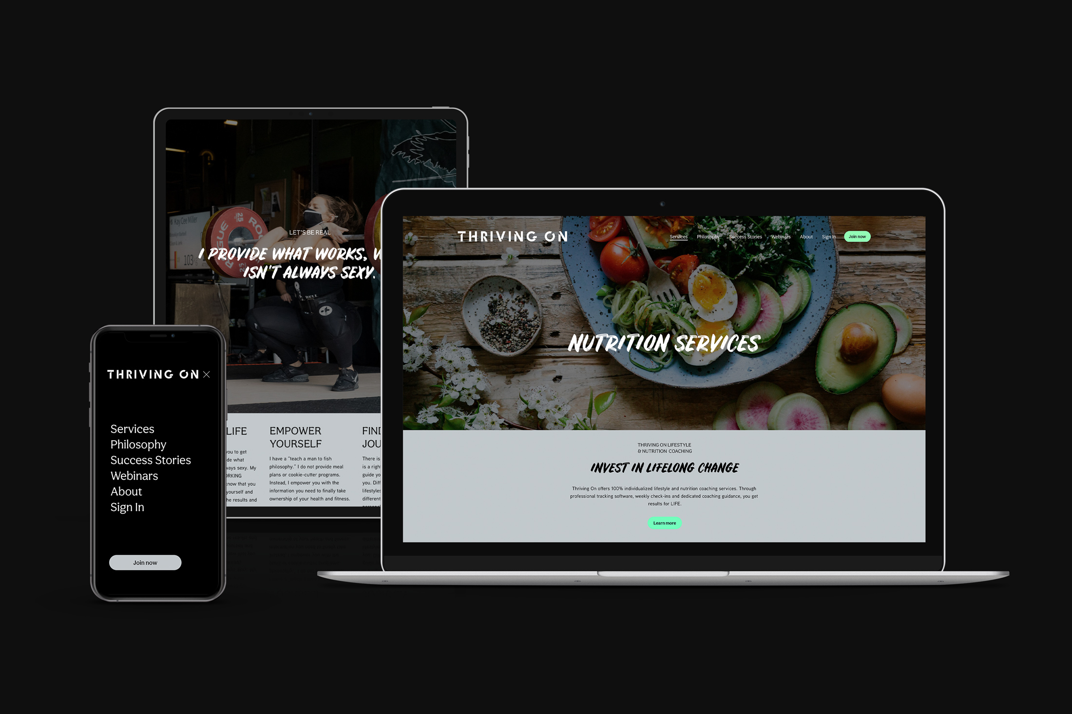
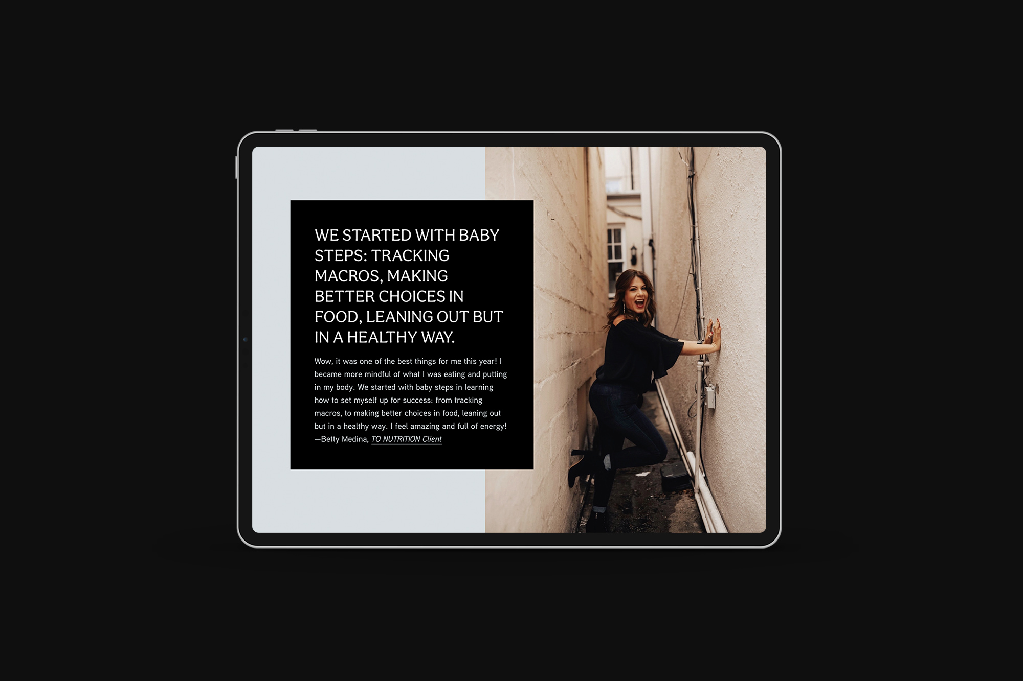
A spotlight on clarity
The biggest problem with KC's previous website was client confusion about her coaching services and a choatic brand design. The site experience was transformed: visitors understood her services with utter clarity and Coach KC presented a bold first impression.