An interface for a new era

DESIGN DIRECTION
FRONT END DEVELOPMENT
UX / UI
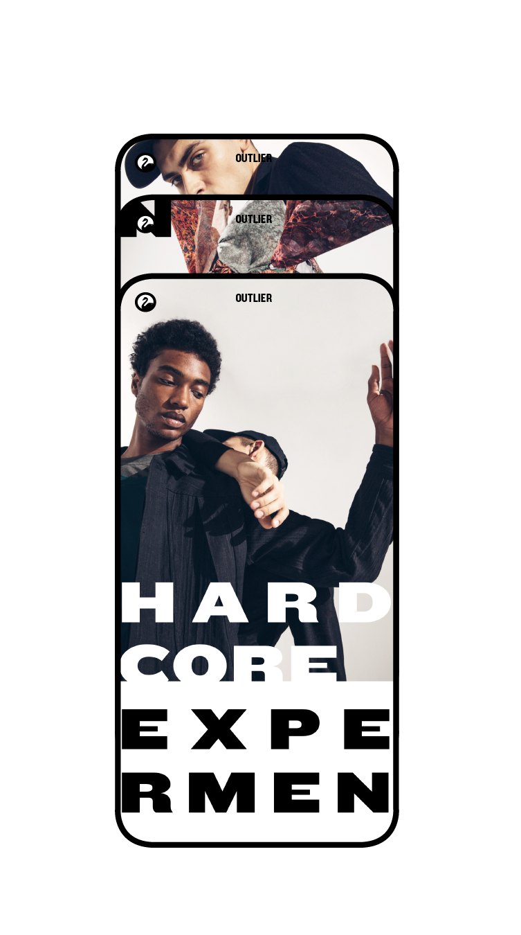
OUTLIER.NYC REDEFINED
Outlier is a NYC menswear company that makes performance-driven clothing. In 2020, we designed, developed and launched a brand new website. Having surfaced data that over 50% of customers intitially encountered the website on mobile, we pivoted to a "mobile-first" interface. This mobile-first approach gave us an incredible opportunity to re-imagine a more profound mobile first experience.
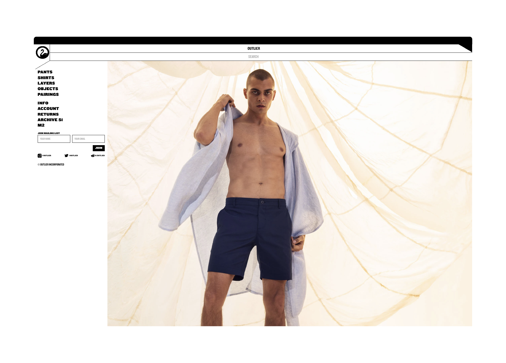
FULL BLEED, FULL SCREEN
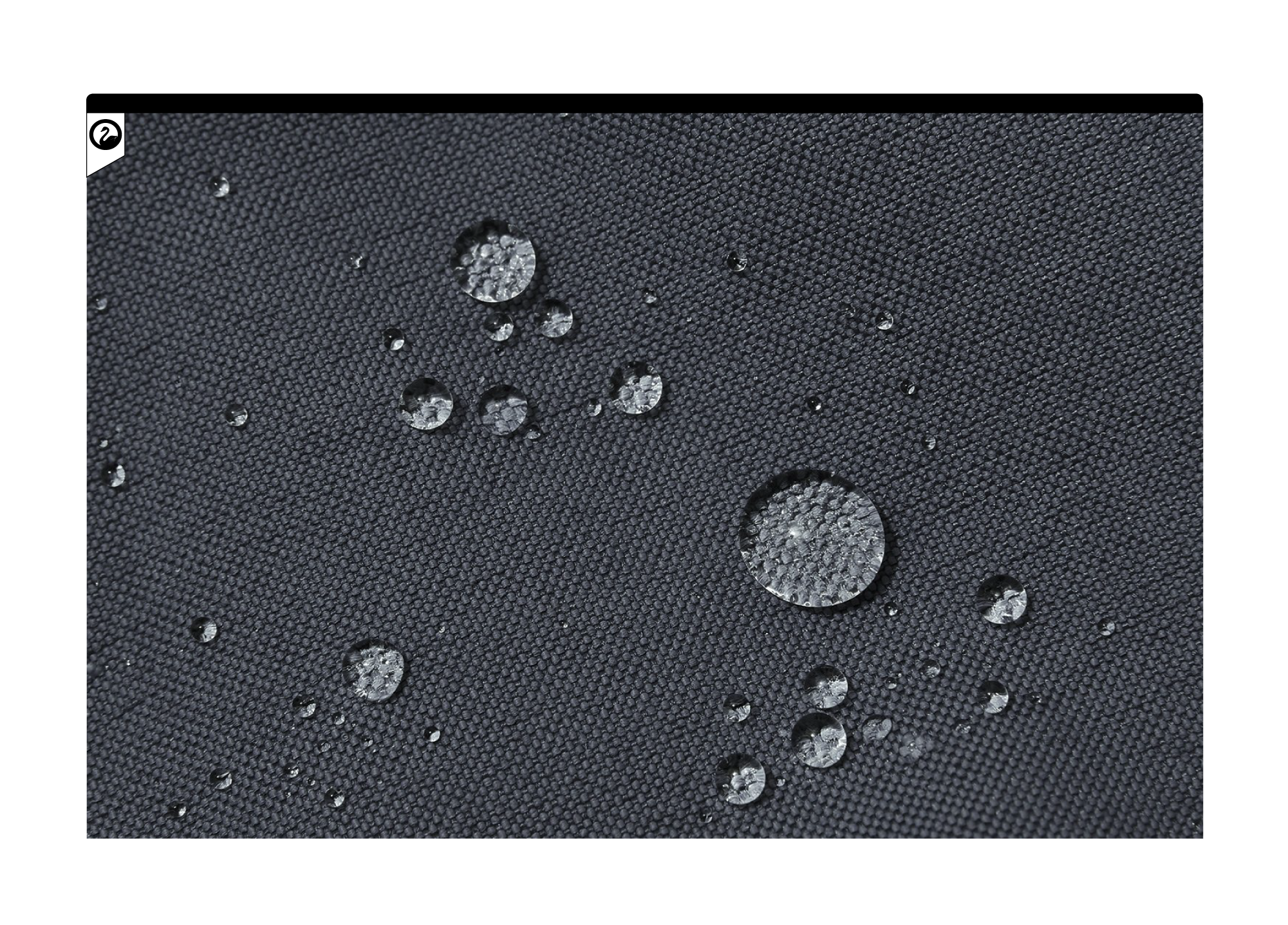
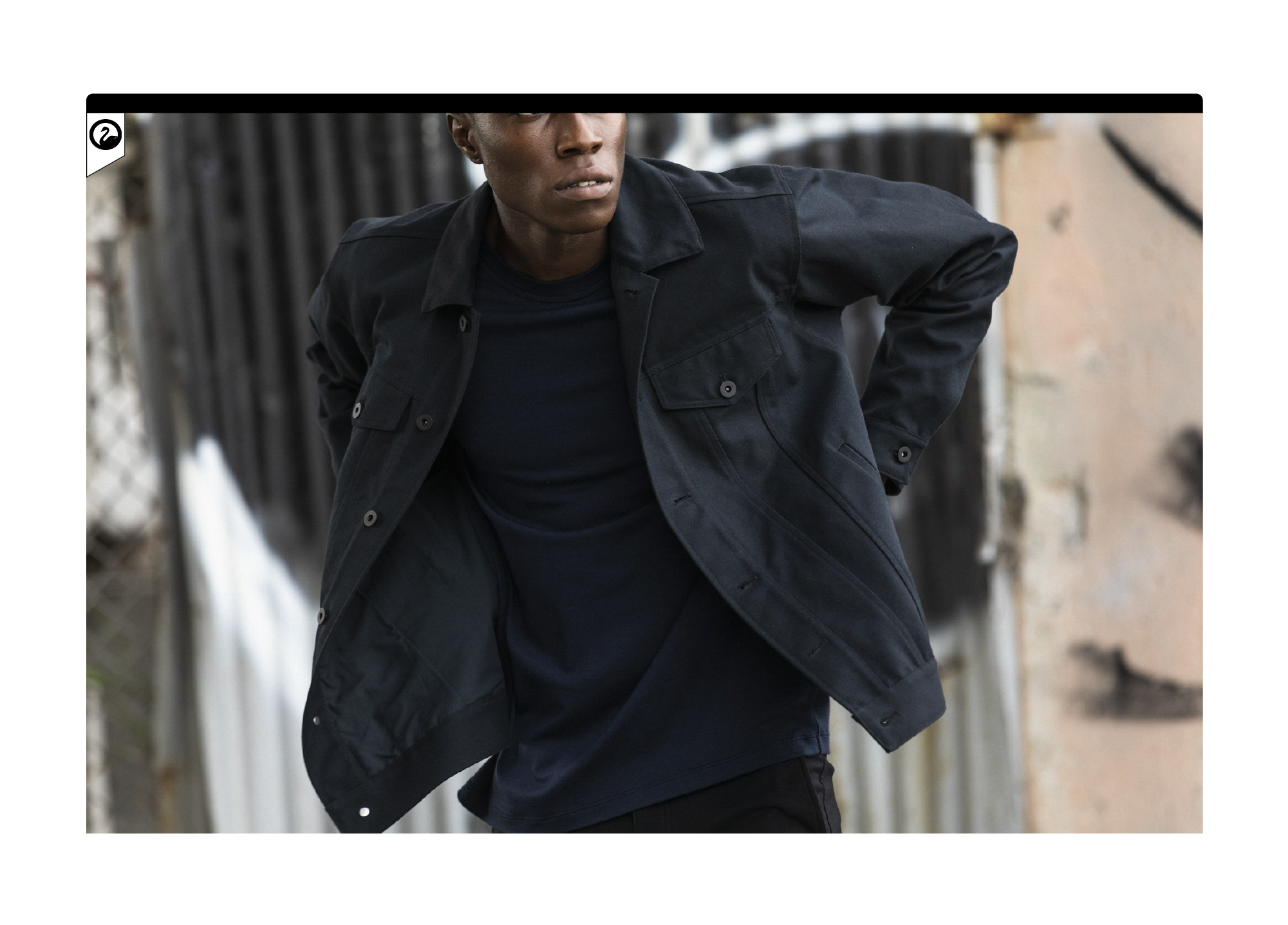
The priority in the mobile experience was creating a fluid experience filled with full-bleed hi-res images. Our previous site had fixed image parameters, essentially restricting the image resolution and detail.
Photos by Emiliano Granado
Our desktop version followed the same full-bleed image principles as the mobile version. A new experience of lush, high res images lends invaluable presence to the clothing.
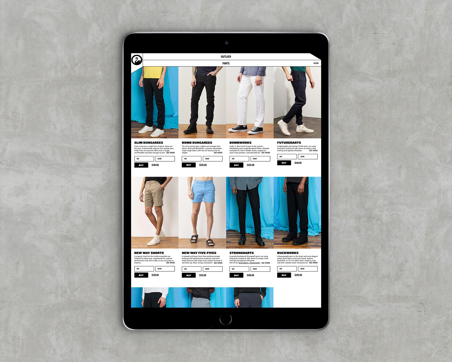
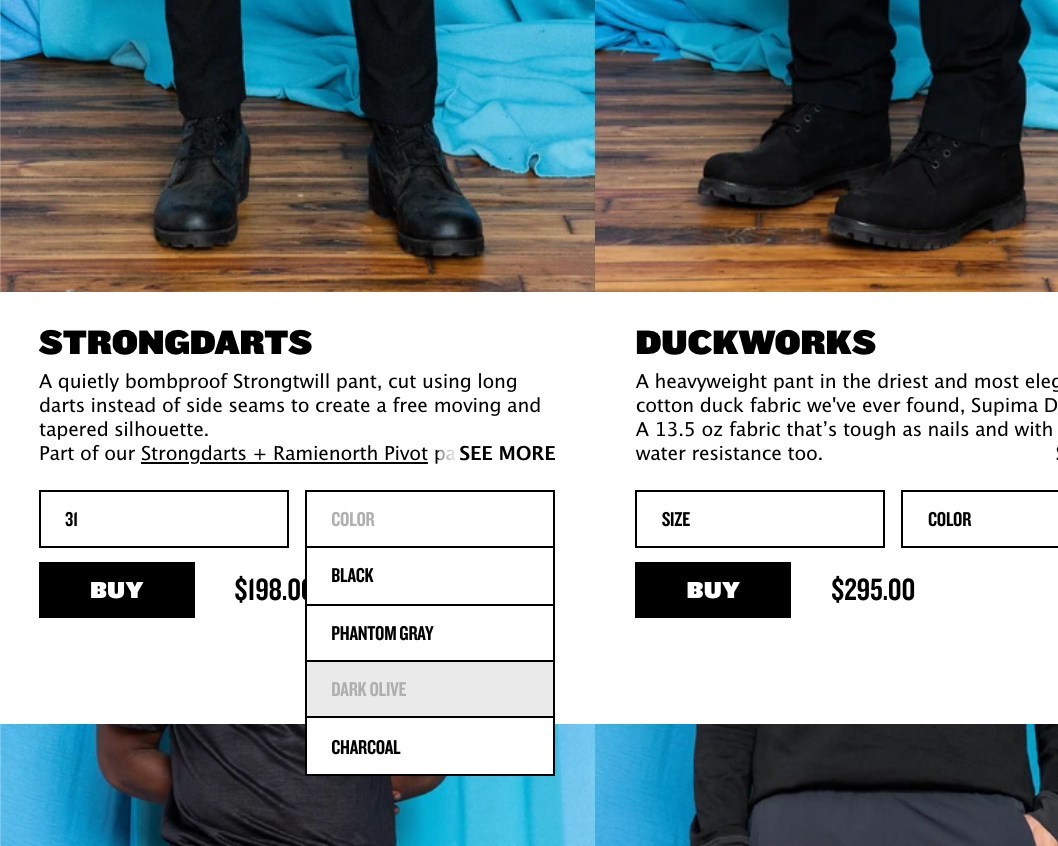
SHOP CATALOG: Our previous shop catalog only displayed micro thumbnail images for the customer to preview before clicking through. Designing for triple the thumbnail size gives the customer immediately understanding. You can also "add to cart" and check stock from the shop page, which is helpful for heavily trafficked release days, where new products sell out nearly instantly.
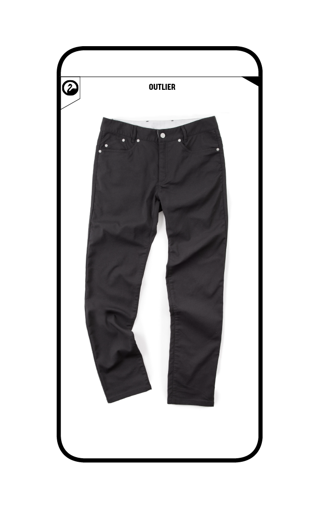
DEVELOPING TEXT AND IMAGE IN HAND
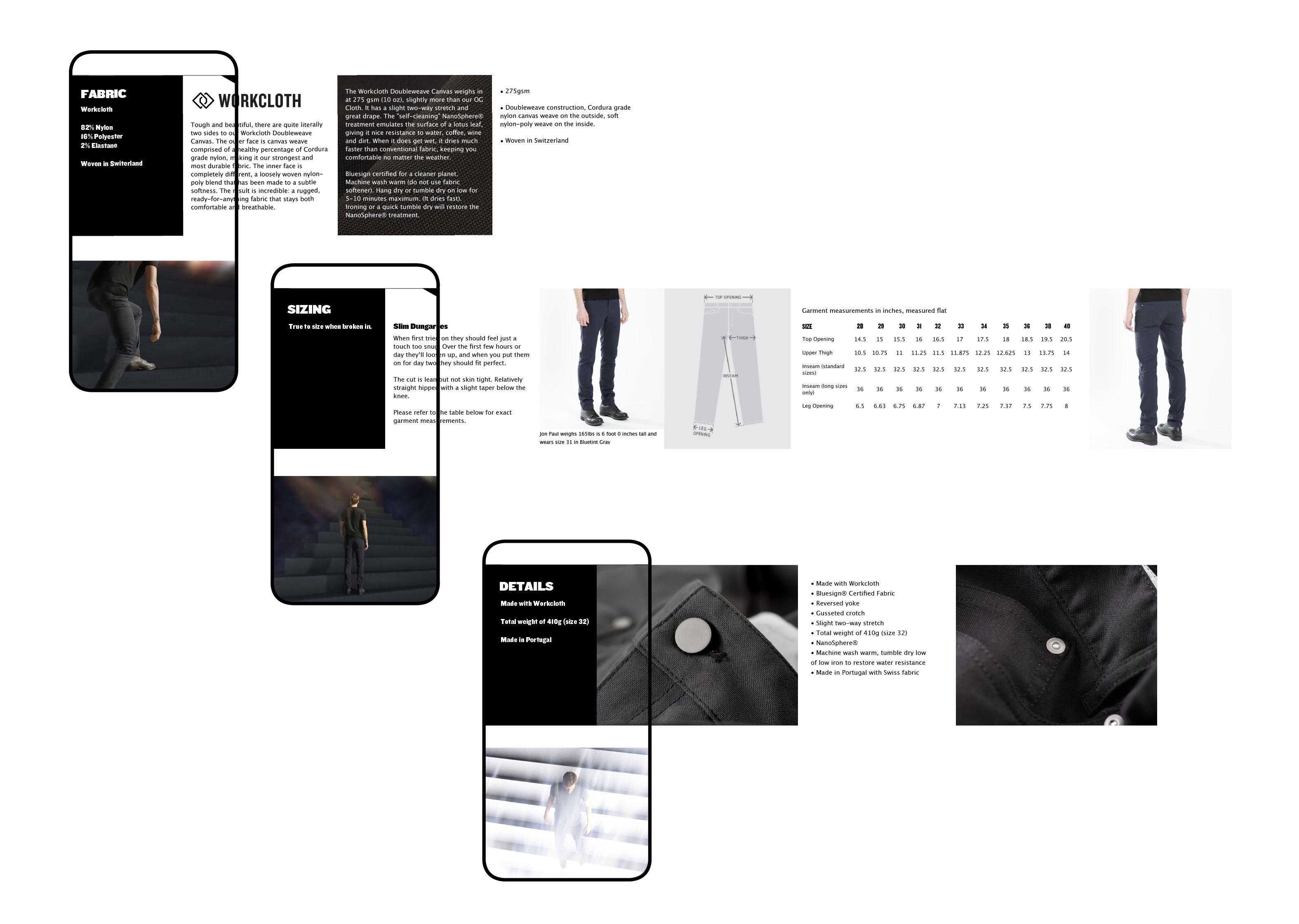
Our previous site featured a minimal page layout chocked with dense information. While our customers loved the "less is more" concept, the mobile version of the site did not optimize current user interactions. The previous image-heavy layouts kept the text information hidden in tabs, promoting a clean UX, but causing some unnecessary friction in the shopping experience. In our new "mobile-first approach" we finessed the informational text with the photo campaign imagery, developing a deep synergy between the two.
Photos by Emiliano Granado
Front End Development with Black & Black
Back End Development by Command C